How to Create Custom Widgets: App Bar, Drawer, and Bottom Navigation Bar in Flutter
Flutter App Development Tutorial | part -IV

I am no longer publishing through HashNode. I have started my own publication Script Portal: https://medium.com/script-portal.
You can also find my video tutorials on my coding Channel: Coding With Nibesh: https://www.youtube.com/@codingWithNibesh
Find out how to create custom and dynamic widgets like App Bar, Bottom Nav Bar, and the Alert Dialog box that works as a Drawer.
Introduction
Hello and Welcome, I am Nibesh Khadka from Khadka's Coding Lounge. This here is the 4th part of the series. Before this, we made a splash screen, created an onboard screen experience for app users, and defined a global theme for our app. In this section, we'll work on three widgets that'll be part of every screen in the app.
Three global widgets we're building are App Bar, Bottom Navigation Bar, and Drawer. All of these three widgets a readily available in Flutter SDK. So usually, you don't have to make custom ones.
For an app bar, as the app grows dynamic content also increases, hence it's better to write it once and use it everywhere with slight modification. As far as navigation goes, we are not going to use a drawer instead, we'll be using the bottom navigation bar. But we'll be using a drawer to manage navigation tasks related to the User Account, for instance, logout, user profile settings, order history, etc. You'll find the source code up until now from this repo.
Creating Custom App Bar
We'll first create an app bar. First, let's create a folder and file for our app bar inside the globals folder.
# Cursor on the root folder
# Create widgets and app_bar folder
mkdir lib/globals/widgets lib/globals/widgets/app_bar

# Create app_bar.dart
touch lib/globals/widgets/app_bar/app_bar.dart
Before we work on the app bar let's consider some features our app bar will have and how can we make it more flexible.
Is the current screen a main screen or sub-screen? If it's a sub-screen we'll have to display the back arrow while hiding it on the main screen.
Let's say we have search functionality, which is triggered by clicking the search icon. In doing so we'll have to go to a sub-page like mentioned previously. Moreover, we'll have to use navigation features as well.
We'll also need a person icon somewhere in the app bar, which we'll trigger the custom drawer we'll create later.
Maybe we'll want to add icons like shopping cart, bell icon, and more depending on the page, we are on.
app_bar
import 'package:flutter/material.dart';
import 'package:go_router/go_router.dart';
import 'package:temple/globals/settings/router/utils/router_utils.dart';

class CustomAppBar extends StatefulWidget with PreferredSizeWidget {
  // Preffered size required for PreferredSizeWidget extension
  final Size prefSize;
  // App bar title depending on the screen
  final String title;
  // A bool to check whether it's a subpage or not.
  final bool isSubPage;
  // An example of search icon press.
  final bool hasSearchFunction;

  CustomAppBar(
      {required this.title,
      this.isSubPage = false,
      this.hasSearchFunction = false,
      this.prefSize = const Size.fromHeight(56.0),
      Key? key})
      : super(key: key);

  @override
  Size get preferredSize => const Size.fromHeight(56.0);

 @override
  State<CustomAppBar> createState() => _CustomAppBarState();
}

class _CustomAppBarState extends State<CustomAppBar> {
  @override
  Widget build(BuildContext context) {
    return AppBar(
      title: Text(widget.title),
      automaticallyImplyLeading: false,
      leading: widget.isSubPage
          ? IconButton(
              icon: const Icon(Icons.arrow_back),
              onPressed: () => GoRouter.of(context).pop(),
            )
          : null,
      actions: [
        widget.hasSearchFunction
            ? IconButton(
                onPressed: () =>
                    GoRouter.of(context).goNamed(APP_PAGE.search.routeName),
                icon: const Icon(Icons.search))
            : const Icon(null),
        IconButton(
            onPressed: () {
              print("Don't poke me!!");
            },
            icon: const Icon(Icons.person))
      ],
    );
  }
}
In Flutter, PreferredSizeWidget is a class interface that can be used to provide default size to a widget that otherwise is unconstrained. The getter function preferredSize is something that the PrefferedSized class requires you to provide and default value we're using 56px. As for the field prefSize, we'll provide the same value for height to the app bar and infinite width as with getter.
Other fields we've declared are all dynamic and need to provide value when called on their relevant pages. The field isSubPage helps to determine if the icons like Back Arrow and Search will appear on a screen or not. Likewise, the person icon will eventually slide the Drawer in and out.
The automaticallyImplyLeading property helps to determine what should be at the front: the title or the back arrow.
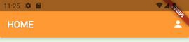
Now, let's go to the homepage and replace the app bar there with the custom app bar.
home
// Changed to custom appbar
      appBar: CustomAppBar(
        title: APP_PAGE.home.routePageTitle,
      ),
// =====//
Except for the title, all other fields have default values. The title of the page can be derived from RouterUtils we made during the 2nd part of this series. And this is what the app bar looks like for now.
We'll need to make some changes when we create the user drawer but for now, let's make the bottom navigation bar.
Create Bottom Navigation Bar
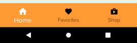
Nowadays, there's a trend to make the bottom nav bar the main navigation bar with tabs on each page as the sub-nav bars, like in the google play store app. After some consideration, we've decided that our main navigation will have links to three screens: Home, Favorites, and Shop. Previously we created the router_utils file to take care of the route necessities like route path, named route path, and page title. Before we proceed through the bottom navigation bar, let's make some changes in the router_utils file first.
enum APP_PAGE {
  onboard,
  auth,
  home,
  search,
  shop,
  favorite,
}

extension AppPageExtension on APP_PAGE {
  // create paths for routes
  String get routePath {
    switch (this) {
      case APP_PAGE.home:
        return "/";

      case APP_PAGE.onboard:
        return "/onboard";

      case APP_PAGE.auth:
        return "/auth";

      case APP_PAGE.search:
        return "/serach";

      case APP_PAGE.favorite:
        return "/favorite";

      case APP_PAGE.shop:
        return "/shop";
      default:
        return "/";
    }
  }

// for named routes
  String get routeName {
    switch (this) {
      case APP_PAGE.home:
        return "HOME";

      case APP_PAGE.onboard:
        return "ONBOARD";

      case APP_PAGE.auth:
        return "AUTH";

      case APP_PAGE.search:
        return "Search";
      case APP_PAGE.favorite:
        return "Favorite";

      case APP_PAGE.shop:
        return "Shop";

      default:
        return "HOME";
    }
  }

// for page titles

  String get routePageTitle {
    switch (this) {
      case APP_PAGE.home:
        return "Astha";

      case APP_PAGE.auth:
        return "Register/SignIn";

      case APP_PAGE.shop:
        return "Shops";

      case APP_PAGE.search:
        return "Search";

      case APP_PAGE.favorite:
        return "Your Favorites";

      default:
        return "Astha";
    }
  }
}
Finally, Let's create relevant files and folders in globals.
# Cursor on the root folder
# Create bottom_nav_bar folder
mkdir lib/globals/widgets/bottom_nav_bar

# Create bottom_nav_bar.dart
touch lib/globals/widgets/bottom_nav_bar/bottom_nav_bar.dart
bottom_nav_bar
Flutter provides a Bottom Navigation Bar widget which is what we'll use to create our bottom navigation bar.
import 'package:flutter/material.dart';
import 'package:go_router/go_router.dart';
import 'package:temple/globals/settings/router/utils/router_utils.dart';
import 'package:flutter/material.dart';
import 'package:go_router/go_router.dart';
import 'package:temple/globals/settings/router/utils/router_utils.dart';

class CustomBottomNavBar extends StatefulWidget {
  // create index to select from the list of route paths
  final int navItemIndex; //#1

  const CustomBottomNavBar({required this.navItemIndex, Key? key})
      : super(key: key);

  @override
  _CustomBottomNavBarState createState() => _CustomBottomNavBarState();
}

class _CustomBottomNavBarState extends State<CustomBottomNavBar> {
  // Make a list of routes that you'll want to go to
  // #2
  static final List<String> _widgetOptions = [
    APP_PAGE.home.routeName,
    APP_PAGE.favorite.routeName,
    APP_PAGE.shop.routeName,
  ];

// Function that handles navigation based of index received
// #3
  void _onItemTapped(int index) {
    GoRouter.of(context).goNamed(_widgetOptions[index]);
  }

  @override
  Widget build(BuildContext context) {
    return BottomNavigationBar(
      // List of icons that represent screen.
      // # 4
      items: const [
        BottomNavigationBarItem(
          icon: Icon(Icons.home),
          label: 'Home',
        ),
        BottomNavigationBarItem(
          icon: Icon(Icons.favorite),
          label: 'Favorites',
        ),
        BottomNavigationBarItem(
          icon: Icon(Icons.shop),
          label: 'Shop',
        ),
      ],

      // Backgroud color
      // ==========================================//
      // #5
      backgroundColor: Theme.of(context).colorScheme.primary,

      currentIndex: widget.navItemIndex, // current selected index
      selectedItemColor:
          Theme.of(context).colorScheme.onPrimary, // selected item color

      selectedIconTheme: IconThemeData(
        size: 30, // Make selected icon bigger than the rest
        color: Theme.of(context)
            .colorScheme
            .onPrimary, // selected icon will be white
      ),
      unselectedIconTheme: const IconThemeData(
        size: 24, // Size of non-selected icons
        color: Colors.black,
      ),
      selectedLabelStyle: const TextStyle(
        fontSize: 20, // When selected make text bigger
        fontWeight: FontWeight.w400, // and bolder but not so thick
      ),
      unselectedLabelStyle: const TextStyle(
        fontSize: 16,
        color: Colors.black,
      ),
      onTap: _onItemTapped,
    );
    // ==========================================//
  }
}
Many things are happening here.
- We created a navItemIndex field, its value will be different for each screen CustomBottomNavBar is called. The value ranges from 0 to 2 since we're only using three screens. Remember in programming, index and position are different.
List of Named Routes for Go_Router to navigate to. The value of navItemIndex we get from the three screens i.e Home, Favorite, and Shop, and the order of the paths in this list should match, or else it'll navigate to the wrong screen.
The _onItemTapped function is responsible to provide the correct route based on the index. Have you noticed that we're not passing any index to the function when it's called down below to the onTap property? That's because we don't have to, the onTap property is built that way.
Icons that'll get displayed on the screens. Here, the Home Icon is the first icon. So, we should call the bottom nav bar at HomeScreen with navItemIndex of 0 and so on.
Here, we style our Navigation Bar, and change the size and color of selected items.
With this the navigation bar is ready. It's time to test it out on the homepage.
home
Scaffold class has a property bottomNavigationBar where we'll pass the custom navigation bar.
appBar:....
bottomNavigationBar: const CustomBottomNavBar(
        navItemIndex: 0,
      ),
body:...
Create Custom Drawer
It's now time to create a User drawer, that'll only handle the navigation of user-related settings, for instance, logout, order history, profile, etc. It'll slide in once we click the person icon in the app bar. Let's proceed to create files and folders first.
# Cursor on root folder
# Create user_drawer folder
mkdir lib/globals/widgets/user_drawer

# Create user_drawer.dart file
touch lib/globals/widgets/user_drawer/user_drawer.dart
Let's go over the design, just to be clear what do we mean by User Drawer. The scaffold has a drawer property, which is configured to slide a panel, usually a Drawer class when triggered. This panel is popularly used as a menu that slides in when a hamburger icon is clicked. However, we already have the bottom nav menu. Moreover, the drawer menu also covers the whole device's height and most of the width which we don't want. So, won't use the Drawer class, instead, we'll pass a alert dialog to the drawer/endDrawer property of Scaffold. The alert dialog will be centered and can have desired dimensions as well.
user_drawer
import 'package:flutter/material.dart';

class UserDrawer extends StatefulWidget {
  const UserDrawer({Key? key}) : super(key: key);

  @override
  _UserDrawerState createState() => _UserDrawerState();
}

class _UserDrawerState extends State<UserDrawer> {
  @override
  Widget build(BuildContext context) {
    return AlertDialog(
      backgroundColor: Theme.of(context).colorScheme.primary,
      actionsPadding: EdgeInsets.zero,
      scrollable: true,
      shape: RoundedRectangleBorder(
        borderRadius: BorderRadius.circular(15),
      ),
      title: Text(
        "Astha",
        style: Theme.of(context).textTheme.headline2,
      ),
// A line between the title section and the list of links
      content: const Divider(
        thickness: 1.0,
        color: Colors.black,
      ),
      actions: [
        // Past two links as list tiles
        ListTile(
            leading: Icon(
              Icons.person_outline_rounded,
              color: Theme.of(context).colorScheme.secondary,
            ),
            title: const Text('User Profile'),
            onTap: () {
              print("User Profile Button Pressed");
            }),
        ListTile(
            leading: Icon(
              Icons.logout,
              color: Theme.of(context).colorScheme.secondary,
            ),
            title: const Text('Logout'),
            onTap: () {
              print("Log Out Button Pressed");
            }),
      ],
    );
  }
}
We're using list tiles that'll act as individual links.
Our drawer is ready, but for it to work properly it is not enough to be added on the home page as value to the endDrawer property of the scaffold. We have to understand and implement the following:
Scaffold is responsible for opening & closing a drawer. Each page has its own scaffold. So, we need to differentiate them with a unique key representing Scaffold State for each scaffold.
The same scaffold key needs to be passed down the Custom App Bar, where we trigger the alert dialog by pressing the person icon.
Global Scaffold Key
Let's go to the home page to create a scaffold key for the home page.
Create Global Key
class _HomeState extends State<Home> {
  // create a global key for scafoldstate
  // #1
  final GlobalKey<ScaffoldState> _scaffoldKey = GlobalKey();
........
Provide Scaffold key to the key properties
return Scaffold(
      // Provide key to scaffold
      // #2
      key: _scaffoldKey,
.....
Pass the key to Custom App Bar
 appBar: CustomAppBar(
        title: APP_PAGE.home.routePageTitle,
        // pass the scaffold key to custom app bar
        // #3
        scaffoldKey: _scaffoldKey,
      ),
You'll get an error because there's no scaffoldKey field in Custom App Bar, ignore it, for now, we'll fix it in a moment.
Pass the Drawer to the drawer property
 // #4
      // Pass our drawer to drawer property
      // if you want to slide left to right use
      // drawer: UserDrawer(),
      // if you want to slide right to left use
      endDrawer: const UserDrawer(),
Note: Remember to repeat this process for each main screen passed onto the bottom navigation bar.
The whole home page now looks like this:
import 'package:flutter/material.dart';
import 'package:temple/globals/widgets/app_bar/app_bar.dart';
import 'package:temple/globals/settings/router/utils/router_utils.dart';
import 'package:temple/globals/widgets/bottom_nav_bar/bottom_nav_bar.dart';
import 'package:temple/globals/widgets/user_drawer/user_drawer.dart';

class Home extends StatefulWidget {
  const Home({Key? key}) : super(key: key);

  @override
  State<Home> createState() => _HomeState();
}

class _HomeState extends State<Home> {
  // create a global key for scafoldstate
  // #1
  final GlobalKey<ScaffoldState> _scaffoldKey = GlobalKey();

  @override
  Widget build(BuildContext context) {
    return Scaffold(
      // Provide key to scaffold
      // #2
      key: _scaffoldKey,
      // Changed to custom appbar
      appBar: CustomAppBar(
        title: APP_PAGE.home.routePageTitle,
        // pass the scaffold key to custom app bar
        // #3
        scaffoldKey: _scaffoldKey,
      ),
      // #4
      // Pass our drawer to drawer property
      // if you want to slide lef to right use
      // drawer: UserDrawer(),
      // if you want to slide right to left use
      endDrawer: const UserDrawer(),

      bottomNavigationBar: const CustomBottomNavBar(
        navItemIndex: 0,
      ),
      primary: true,

      body: SafeArea(
        child: Container(
            padding: const EdgeInsets.all(20),
            color: Theme.of(context).colorScheme.background,
            child:
                Column(mainAxisAlignment: MainAxisAlignment.start, children: [
              Card(
                child: Container(
                  width: 300,
                  height: 200,
                  padding: const EdgeInsets.all(4),
                  child: Column(
                      crossAxisAlignment: CrossAxisAlignment.start,
                      children: [
                        Text(
                          "Hi",
                          style: Theme.of(context).textTheme.headline2,
                          textAlign: TextAlign.left,
                        ),
                        Text(
                          "Lorem ipsum dolor sit amet, consectetur adipiscing elit. Eu id lectus in gravida mauris, nascetur. Cras ut commodo consequat leo, aliquet a ipsum nulla.",
                          style: Theme.of(context).textTheme.bodyText1,
                        )
                      ]),
                ),
              ),
              Row(
                mainAxisAlignment: MainAxisAlignment.spaceAround,
                children: [
                  TextButton(
                    child: const Text("Text Button"),
                    onPressed: () {},
                  ),
                  ElevatedButton(
                    child: Text(
                      "Hi",
                      style: Theme.of(context).textTheme.bodyText1!.copyWith(
                            color: Colors.white,
                          ),
                    ),
                    onPressed: () {},
                  ),
                ],
              )
            ])),
      ),
    );
  }
}
Open Drawer Using ScaffoldKey
Now, we need to make changes to the custom app bar.
Create and pass the Global Scaffold Key
// Declare new  global key field of type ScaffoldState
  // #1
  final GlobalKey<ScaffoldState> scaffoldKey;

  const CustomAppBar(
      {required this.title,
      required this.scaffoldKey, //#2 pass the new scaffold key to constructor
      this.isSubPage = false,
      this.hasSearchFunction = false,
      this.prefSize = const Size.fromHeight(56.0),
      Key? key})
      : super(key: key);
This should fix the error we're facing.
Pop Alert Dialog On Tap
 IconButton(
          icon: const Icon(Icons.person),
          // #3
          // Slide right to left
          onPressed: () => widget.scaffoldKey.currentState!.openEndDrawer(),
          // slide lef to right
          // onPressed: () => widget.scaffoldKey.currentState!.openDrawer(),
        ),
Now, the alert dialog will work as a custom user drawer. Have a look at this short clip about its workings.
Homework
Here are a few tasks for you to practice:
- Create A simple favorite and shop screen.
- Link your bottom navigation bar to these screens.
- Only on the shop page display a shopping cart in the app bar.
- Create a search page:
- It should be a sub-page of the home page. You can use a search icon, that'll navigate to the search page, on tap.
- It should only display the back arrow icon as a leading icon.
- Pressing the back arrow should take you back to the home page.
- Sub-pages don't have a bottom navigation bar, so don't display it there.

Summary
With this comes an end to 4th installment of the series: Flutter App Development Tutorial. This series was dedicated to creating global widgets that we'll be using throughout the application. Here,
- We created a custom app bar, which will display icons based on the conditions we've provided.
- We also made a menu that'll stick at the bottom of our application instead of sliding in and out.
- We also created a secondary menu that'll be responsible for navigating to the user's settings like profile, order history, logging the user out, etc.
Show Support
That's it for today. We'll work on Firebase and Authentication in the next section. If you have any questions then leave them in the comment section. You can even upload a screenshot of the homework task.
Thank you for your time. Don't hesitate to give the article like and subscribe to get notified for the next installments of the series.